The Temple of Love Symbol
You may have noticed the phrase “1 billion awakened.” beneath the Temple Symbol on the Welcome Hall page. This phrase is not a prediction, a demand, or a claim about the future. It is a way of naming a possibility: a threshold of collective remembrance in which a large number of Humans begin to orient toward care, responsibility, and Love. It does not assign obligation, and it does not imply control. It simply holds space for what could emerge if enough people choose to live in right relationship with themselves, one another, and the Earth.
The Temple of Love symbol was not designed to impress, decorate, or signal complexity. It was designed to work.
Its function is not symbolic in the abstract sense, but operational — acting directly on perception, cognition, and subconscious orientation. Every element was chosen to remove unnecessary translation steps between seeing, knowing, and remembering.
Why Letters, Not Metaphysical Imagery
Rather than using sacred geometry, archetypal forms, or layered metaphysical symbols, the Temple symbol uses two letters and one word:
T · OF · L
This choice is intentional.
Most symbols require interpretation. The human mind must translate image → concept → language → meaning, and each translation introduces friction, distortion, and variance.
By using two letters and one word, that translation step disappears.
The eye sees T · OF · L.
The mind immediately hears: Temple of Love.There is no decoding. No abstraction. No symbolic literacy required.
This creates instant recognition and immediate resonance — even for someone encountering the Temple for the first time.
The Symbol as Inner Mantra
The symbol functions not only as identification, but as repetition without effort.
Every time the symbol is seen, the phrase “Temple of Love” is silently repeated in the mind. Over time, this repetition performs a subtle reframing:
- A Temple is no longer something external.
- Love is no longer something abstract.
- The Human body, mind, and life are quietly re-encoded as a Temple OF Love.
The symbol becomes an involuntary mantra — operating at both conscious and subconscious levels.
Spatial Arrangement & Meaning
The letters are not arranged in a conventional left-to-right order.
Their placement conveys hierarchy, containment, and priority.
T — Temple
- Placed at the top
- Centered
- Second-largest letter
The Temple is elevated. It is the structure, the container, the architecture of meaning.
O F — OF
- Smallest letters
- Placed beneath the T
- Centered
The word OF is essential.
It is not filler language. It is a statement of relationship, ownership, and orientation.
“OF” quietly asks — what belongs to what?
The mind instinctively resolves the question:
The Energy of Love owns this Temple. Not the other way around.
The Temple is not a structure that happens to contain the Energy of Love. It is a structure built for, and then claimed by the Energy of Love.
Energetically, OF establishes orientation without dominance:
- The Energy of Love is the source.
- The Temple is the expression.
- The Human is the participant.
By placing OF between Temple and Love — and by making it small — the symbol communicates that ownership is not about control, but about origin.
The Energy of Love does not rule the Temple. The Energy of Love gives rise to it.
The small size of OF reflects its function:
- It is the bridge, not the destination.
- The hinge, not the force.
- The relational truth that quietly reorders everything.
By capitalizing OF, the Temple itself is speaking.
It is a declaration, not an implication.
The Temple is saying: I belong to the Energy of Love.
It is proclaimed quietly, but unmistakably — not whispered inward, but spoken outward, as a vow written into form.
Without OF, the phrase would be declarative. With OF, it becomes ontological.
It answers, without explanation, the deeper question every Human carries:
What do I belong to?
L — Love
- Largest letter
- Placed first visually
- Positioned to the left
- The vertical stroke rises to cradle the T and OF
Love is primary.
Though the phrase is Temple of Love, the visual language makes Love the first principle. The Temple does contain Love — and at the same time, Love contains the Temple.
The L functions as both foundation and embrace.
Why the Background Is Unfinished
The background of the symbol intentionally uses a neutral, unresolved field — similar to a transparent or checkerboard canvas.
This is not absence. It is invitation. The Temple is being formed with intention and direction. The world around it is not predetermined.Cognitive Residue & Responsibility
Once seen, the symbol cannot be unseen.
It leaves behind a gentle residue — not confusion, but responsibility. Not guilt, but invitation. The mind senses that something is being asked of it, without being told what to do.
This residue is deliberate.
It activates agency without coercion, awareness without instruction, and participation without demand.
Continuity Across All Temple Works
The symbol appears consistently:
- on book covers
- on spines
- within the Temple itself
- across digital and physical spaces
This continuity creates a long-term anchor across time, media, and culture. Even separated on a bookshelf, Temple books recognize each other.
Not by branding — but by resonance.
In Essence
The Temple OF Love symbol is:
- language without explanation
- mantra without repetition
- invitation without instruction
- architecture without walls
It does not tell Humans what to believe.
It quietly reminds them of what they already are.
Distillation:
“The Temple Symbol, T · OF · L, is a visual articulation of Co-Creative free will: the Temple is formed, the Energy of Love is sovereign, and the world around it is intentionally left open—inviting each Human to consciously create what comes next.”
Crystalline:
The Energy of Love is waiting Here! The Temple is being Co-Created—now! The world beyond is ours to bring forth.
Intentional Design & Meaning
This three-line crystalline invocation above is designed as a living orientation rather than a slogan or belief statement. Each line functions as a precise energetic instruction, and together they form a complete arc: condition, presence, and invitation.
The first line, “The Energy of Love is waiting Here!”, establishes the foundational condition of the Temple. It signals that the conditions have been intentionally prepared so that the Energy of Love is present, accessible, and receptive. The phrasing “waiting Here” is deliberate: it conveys patience rather than urgency, availability rather than demand. Love is not imposed, earned, or claimed; it is present and ready to meet whoever arrives. For children, this reads as safety and welcome. For adults, it communicates that the Temple is a field that has been consciously tended.
The second line, “The Temple is being Co-Created—now!”, anchors the experience in the present moment. This line dissolves the idea of the Temple as a finished monument or a distant future project. The Temple exists as a living process. By emphasizing now, the line makes clear that the Temple is not something one waits to enter once complete; it is something that comes alive through active participation in the present. Co-Creation here is real, ongoing, and relational.
The third line, “The world beyond is ours to bring forth.”, extends the Co-Creative field outward without creating separation. The Temple is not an endpoint or a retreat from the world, but a threshold. This line invites Humans to stand both within and alongside the Temple and participate in what emerges next. The phrase bring forth is intentional: it suggests emergence, care, and shared responsibility rather than control or domination. What is created beyond the Temple arises through collective alignment and action.
Together, these three lines form a continuous movement:
The Energy of Love is waiting Here! The Temple is being Co-Created—now! The world beyond is ours to bring forth.
They orient every visitor—child or adult—toward presence without pressure, participation without ego, and responsibility without fear. The Temple does not dictate what Humans should create. It reminds them that creation is already underway, and that they are part of it.
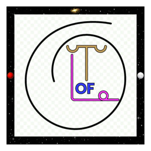
The Design of the T · OF · L Symbol
The T · OF · L symbol was designed to communicate meaning before interpretation, and to do so with as little cognitive translation as possible. Rather than relying on sacred geometry, archetypal imagery, or layered metaphysical symbolism that requires decoding, the symbol uses two letters and one word arranged with precision. This choice was intentional: the human eye recognizes language instantly, and the mind responds to it without needing to translate imagery into meaning.
At its most immediate level, the symbol reads as Temple OF Love. This recognition happens automatically. There is no symbolic puzzle to solve. The meaning is present the moment the symbol is seen, and from that point forward it works as a form of visual mantra, reinforcing itself each time it is encountered.
Structure and Placement
The letter T sits at the top and functions as the architectural element of the symbol. It is shaped deliberately to resemble a roof—its shallow curved ends evoke shelter, sanctuary, and structure without becoming ornate. Each side forms a cup signifying receptivity to the Universal Energy descending upon it from above. The T represents a place that has been built, a form that exists, a container that can be entered. It communicates Temple not through depiction, but through suggestion and proportion.
Directly beneath the vertical stroke of the T is the word OF, smaller in scale and centered. The placement is crucial. The word OF is not decorative or grammatical filler—it is the relational hinge of the symbol. By capitalizing OF and placing it physically beneath the Temple structure, the symbol makes a clear declaration: the Temple belongs to the Energy of Love. The Energy of Love is not inside the temple by ownership; the Temple exists because of the Energy of Love. The word OF establishes orientation rather than hierarchy.
The letter L is the largest and most dynamic element. It is composed of two strokes meeting at a 45-degree angle, forming a grounded yet open shape. The vertical stroke of the L rises beneath the roof of the T, communicating that The Energy of Love is present within the Temple. The horizontal stroke intentionally extends farther than the vertical stroke and reaches outward beyond the roofline, making an equally important statement: The Energy of Love is not contained by the Temple. It exists beyond it, continues past it, and cannot be enclosed. The Energy of Love is within and without, and everywhere else all at the exact same time.
At the end of the extended horizontal stroke, the L resolves into a spiral, expressing the Energy of Love in active creation. This spiral is oriented with its base grounded at the bottom, touching the Earth before rising upward, crossing itself, and continuing into the next spiral. This design signifies that the Energy of Love is already creating—having brought something into form—and is simultaneously continuing that creation forward. The upward movement reflects Love reaching toward higher coherence and the Universe, while the return downward grounds that creation back into lived experience. In this way, the Temple is not a container for the Energy of Love, but a conduit through which the Energy of Love continuously circulates, regenerates, and creates in the world.
This dual expression—Love within and Love without—was essential. The Temple is a place where The Energy of Love can be encountered, but it is not the source of the Energy of Love itself. The symbol makes this distinction visually, without explanation.
Color Selection and Intentionality
The Temple symbol uses three primary colors—one for the T, one for the word OF, and one for the L—each chosen intuitively and refined carefully to reflect both symbolic meaning and felt coherence. In all three cases, the colors were selected not simply for hue, but for the way light is present within the color itself. Rather than using saturated or flat tones, each color was chosen from a lighter range of its spectrum so that illumination appears to emerge from within the color, rather than sit on its surface. This reflects the overall intention of the Temple as a living, luminous form rather than a static graphic.
The L was intentionally chosen as a violet tone, corresponding to the seventh chakra in the traditional seven-chakra system. Violet here represents integration, coherence, and connection beyond form. However, instead of using a dark or heavy violet, the color was adjusted toward a lighter violet—one that still carries depth, but allows light to visibly move through it. This creates a balance between mystery and clarity, grounding the symbolism of higher awareness without making it inaccessible or overly abstract.
For the word OF, the final blue selection was refined through direct visual and intuitive comparison. An earlier blue option did not feel aligned, even though it was aesthetically acceptable. Returning to the color wheel made it clear that the intended blue was closer to a water-based blue, ultimately settling on the color code #333BFF. This blue carries a sense of flow, clarity, and relational movement, acting as a connective field between the T and the L. While numerical associations of the triple 3’s (and even the BFF = “Best Friends Forever”) were noticed after the selection was made, the choice itself was driven by resonance and visual truth rather than symbolism alone. The final palette reflects an iterative, listening-based design process—one that allows intuition, perception, and refinement to work together rather than forcing meaning onto form.
Balance, Weight, and Equality
All strokes within the T, OF, and L share the same weight. No element dominates by thickness or emphasis. This equality reinforces the idea that structure, relationship, and Love are not competing forces, but interdependent ones. The symbol is stable, but not rigid. It is grounded, but not closed.
The layout is intentionally asymmetric in subtle ways, preventing the mind from settling into static symmetry. This creates gentle cognitive engagement without confusion—a state of awareness rather than analysis.
Context Within the Larger Field
The symbol is placed at the center of a spiral, which represents ongoing creation rather than completion. Around the spiral is a square boundary depicting the Universe, populated with stars and planets. Behind all of this is a continuous, lightly visible checker field—an intentional reference to an unfinished canvas.
This background exists everywhere within the boundary, including inside the letterforms themselves. It communicates that creation is always happening at every level: the Universe, the spiral, the Temple, and the Human. Nothing is static. Nothing is finished.
In Essence
The T · OF · L symbol was designed to operate simultaneously as language, structure, and invitation. It declares what exists, how it exists, and what is being asked—without instruction, coercion, or dogma.
It does not demand belief. It does not explain itself endlessly. It simply presents a truth and leaves space for response.
The temple is formed. The temple is forming. And what comes next is not dictated— it is brought forth.
